About Sylatech
Sylatech Construction Limited
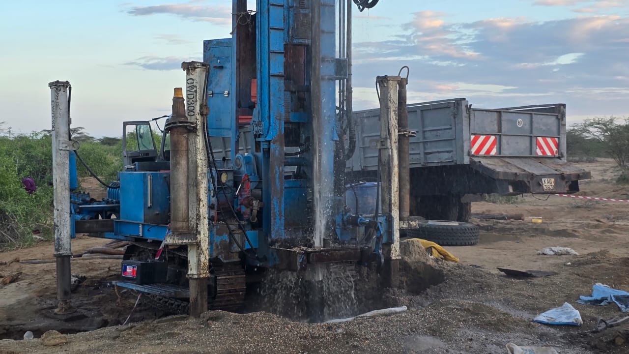
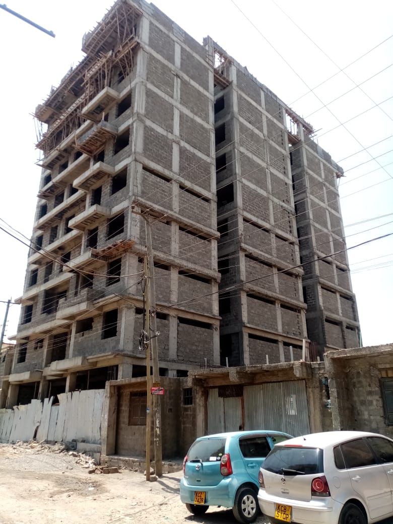
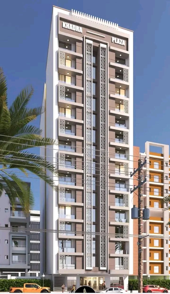
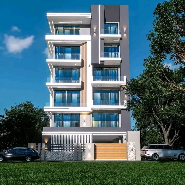
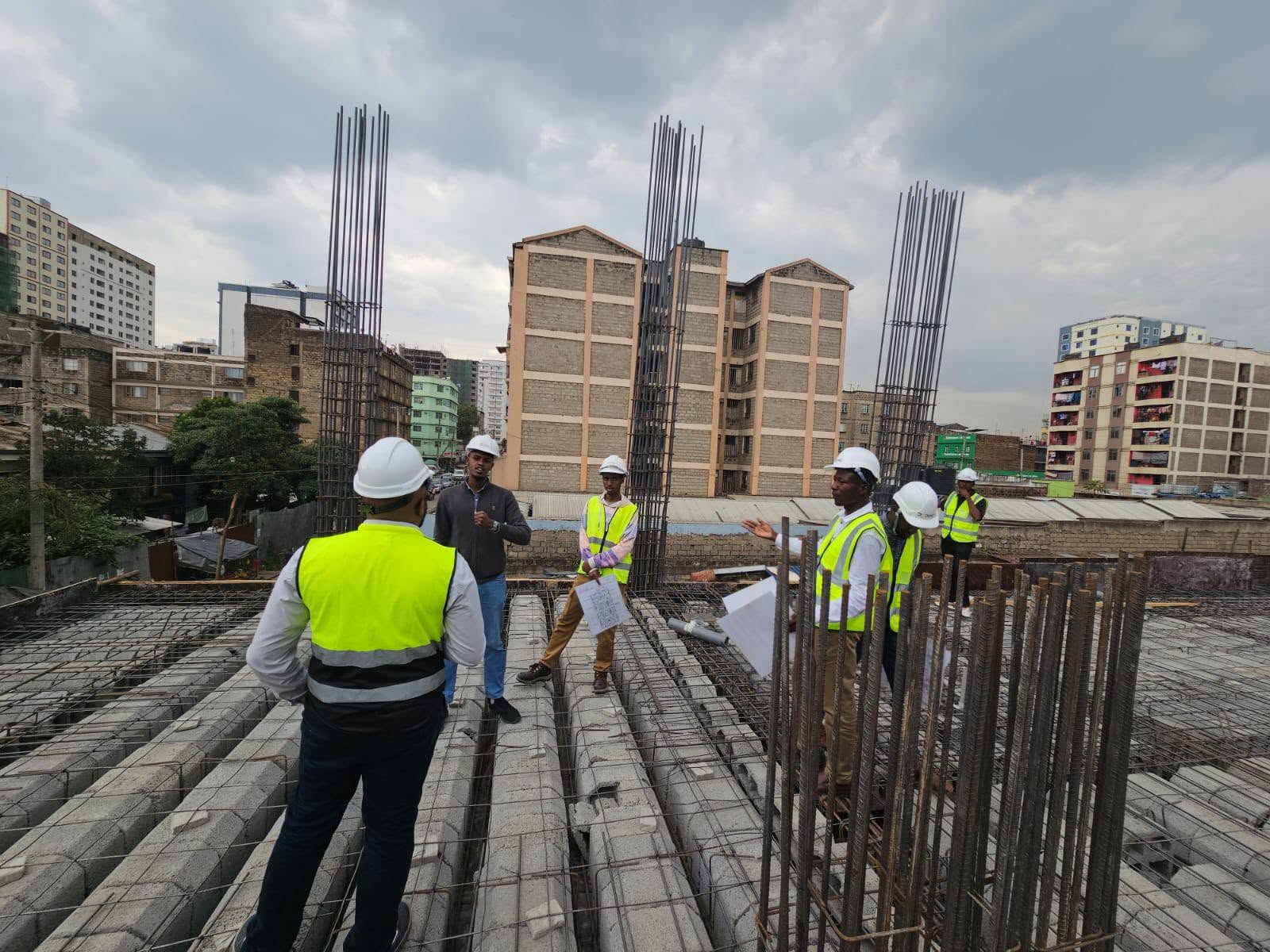
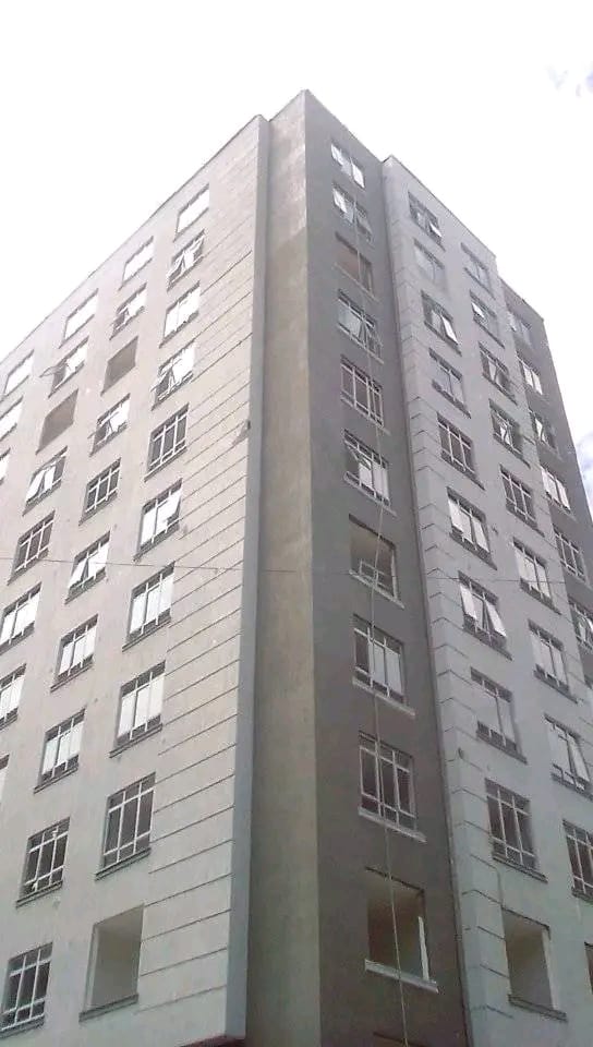
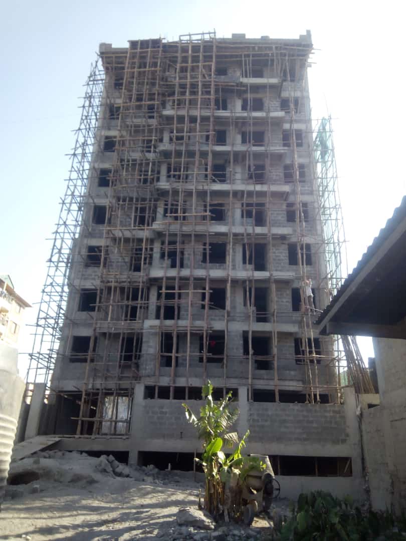
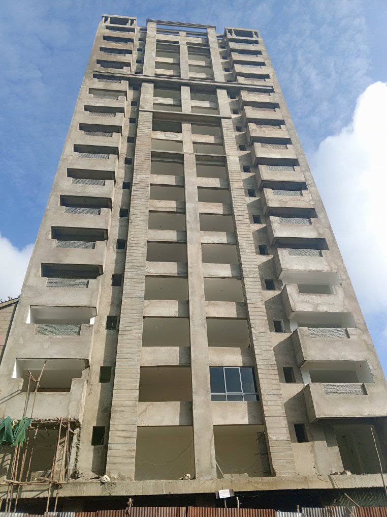
Sylatech Construction Limited has been shaping Kenya's skyline with integrity and innovation. Headquartered in Nairobi, we serve clients across all 47 counties and beyond. Our approach combines modern technology with local expertise, ensuring your project is delivered on time and within budget.
2010
Year Founded
15+
Years Experience
350+
Projects Done